Order, Tailwind, DRY
(Order in the CSS rule sense, not the metaphysical sense.)
The time has come to begin exfiltrating some higher-traffic, higher-leverage parts of Buttondown's admin UI away from the autogenerated Django admin and into some more bespoke components.
Take, for instance, this rather grisly (but useful) inline admin table:
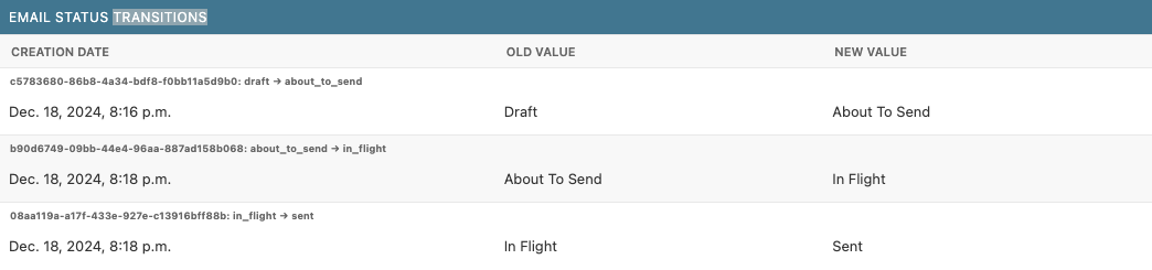
This contains useful information but is annoying to parse. It gets replaced with the following HTML, all still governed by Django and a wallop of Tailwind Not mobile friendly, I'm afraid! Not exactly a pressing concern for the admin site at the moment.:
-
draft
-
about_to_send
-
in_flight
-
sent
It's a trivial thing, but lets me pull out a new toy that I learned from Mary a few weeks back: order, which lets you re-arrange the rendering order of elements in a flex container irrespective of their original order.
For instance, consider the following:
<div class="flex gap-1">
  <div class="order-2">world</div>
  <div class="order-1">hello</div>
</div>
This, as you might expect, renders as:
Where this gets really useful is composition with groups. Consider the following:
<div class="flex gap-1 w-[200px]">
  <div class="group flex-1 flex items-center">
    <div class="z-10 flex items-center justify-center size-6 bg-red-500"></div>
    <div class="w-full bg-gray-200 h-0.5"></div>
  </div>
  <div class="group flex-1 flex items-center">
    <div class="z-10 flex items-center justify-center size-6 bg-red-500"></div>
    <div class="w-full bg-gray-200 h-0.5"></div>
  </div>
  <div class="group flex-1 flex items-center">
    <div class="z-10 flex items-center justify-center size-6 bg-red-500"></div>
    <div class="w-full bg-gray-200 h-0.5"></div>
  </div>
</div>
This renders, unexcitingly, as:
But! Add a tiny sprinkle of group-last:
<div class="flex gap-1 w-[200px]">
  <div class="group flex-1 flex items-center">
    <div
      class="z-10 flex items-center justify-center size-6 bg-red-500 group-last:bg-blue-500"
    ></div>
    <div class="w-full bg-gray-200 h-0.5 group-last:order-first"></div>
  </div>
  <div class="group flex-1 flex items-center">
    <div
      class="z-10 flex items-center justify-center size-6 bg-red-500 group-last:bg-blue-500"
    ></div>
    <div class="w-full bg-gray-200 h-0.5 group-last:order-first"></div>
  </div>
  <div class="group flex-1 flex items-center">
    <div
      class="z-10 flex items-center justify-center size-6 bg-red-500 group-last:bg-blue-500"
    ></div>
    <div class="w-full bg-gray-200 h-0.5 group-last:order-first"></div>
  </div>
</div>
And you get:
Obviously, that is a lot of HTML to write for a very simple outcome. There are a bunch of ways you could reduce this. Why so much repetition? Why specify group-last for every node when you know it's going to be the last one?
Because in reality, the above HTML is actually, in Django, a pure and concise for loop:
<div class="flex gap-1 w-[200px]">
  {\% for item in items \%}
  <div class="group flex-1 flex items-center">
    <div
      class="z-10 flex items-center justify-center size-6 bg-red-500 group-last:bg-blue-500"
    ></div>
    <div class="w-full bg-gray-200 h-0.5 group-last:order-first"></div>
  </div>
  {\% endfor \%}
</div>
Which suddenly looks much more pleasant and maintainable than its conditionally-rendered alternative:
<div class="flex gap-1 w-[200px]">
  {\% for item in items \%}
  <div class="group flex-1 flex items-center">
    <div
      class="z-10 flex items-center justify-center size-6 {\% if forloop.last \%} bg-blue-500 {\% else \%} bg-red-500 {\% endif \%}"
    ></div>
    <div
      class="w-full bg-gray-200 h-0.5 {\% if forloop.last \%} order-first {\% endif \%}"
    ></div>
  </div>
  {\% endfor \%}
</div>